
COLOUR MATCHING IN A NUTSHELL
“Can I wear a yellow tie with an orange pocket square?”
“What about an olive green watch with a lime green bracelet?”
Sure. You can wear whatever you want. You’re an individual. You do you.
But, there’s a huge difference between defiantly challenging aesthetic norms like a true style rebel and clumsily tripping over them like an overenthusiastic toddler.
The difference is knowledge.
Join us as we dive head-first into the world of colour theory and explore how to best create a cohesive look through contrast and complementation.

- Use the colour wheel to coordinate colours.
- Choose colour schemes that enhance your natural features.
- Match your accessories to your skin tone.

- Let accessories overpower your outfit.
- Mix too many bold colours.
- Forget that subtlety can be the most powerful statement.
BASICS OF COLOUR THEORY
To make your outfit pop, your colours should harmonise.
This applies to everything you wear - from the dial on your watch to your tie and the colour of your suit to your ascot. Accessories should enhance your look, complement your skin and hair tones, and draw attention to your best feature: that ruggedly handsome face of yours.
The key is balance. Your accessories should never overpower your outfit. When they do, they overshadow your natural attributes instead of highlighting them, leading to a cringy 'overdoing it' look.

MAKING YOUR COLOUR WHEEL
Time to revisit primary school and brush up on the colour wheel.
PRIMARY COLOURS

Red, Blue, Yellow. These are the base colours that can't be created by mixing others. They're vibrant and attention-grabbing, often used in patterns and motifs to stand out against darker backgrounds.
SECONDARY COLOURS
.jpg?format=pjpg&auto=webp&quality=75%2C90&width=1500)
Green, Purple, Orange. Created by mixing primary colours, they sit opposite a primary colour on the wheel, offering maximum contrast. These complementary colours are eye-catching and bold.
TERTIARY COLOURS
.jpg?format=pjpg&auto=webp&quality=75%2C90&width=1500)
Vermilion (red-orange), Amber (yellow-orange), Chartreuse (yellow-green), Teal (blue-green), Violet (blue-purple), Magenta (red-purple). These are formed by mixing primary and secondary colours. Think of them as unique hues with their own distinct properties and complements on the colour wheel.
COLOUR SCHEMES
Understanding colour schemes is crucial for mastering style with your textile accessories.
NEUTRAL COLOUR SCHEME
.jpg?format=pjpg&auto=webp&quality=75%2C90&width=1500)
White, black, or grey. These colours are versatile and pair with anything.
MONOCHROMATIC COLOUR SCHEME
.jpg?format=pjpg&auto=webp&quality=75%2C90&width=1500)

Using variations of a single hue. This creates a cohesive and subtle look.
ANALOGOUS COLOUR SCHEME
.jpg?format=pjpg&auto=webp&quality=75%2C90&width=1500)

Colours next to each other on the wheel, offering a harmonious yet slightly varied palette.
COMPLEMENTARY COLOUR SCHEME
.jpg?format=pjpg&auto=webp&quality=75%2C90&width=1500)

Colours opposite each other on the wheel. They provide strong contrast and are perfect for bold, attention-grabbing outfits.
TRIADIC COLOUR SCHEME
.jpg?format=pjpg&auto=webp&quality=75%2C90&width=1500)

Three colours evenly spaced on the wheel, offering a balanced and visually appealing combination with moderate contrast.
Square, tetradic, and split-complement schemes are advanced colour schemes that should only be attempted once you've mastered the schemes above.
THE 6 LEVELS OF COLOUR MASTERY
- BEGINNER – Classic White Pocket Square
Universally flattering and goes with everything. - APPRENTICE – Neutral Colours
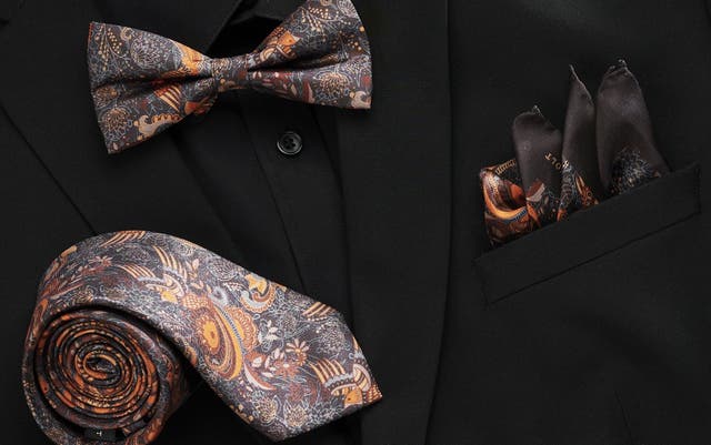
Greys, browns, and whites. Easy to match with any jacket or neutral tie. - PROFICIENT – Monochromatic Schemes
Different shades of the same colour. E.g., tan with beige for a subtle contrast. - ADEPT – Adjacent Colour Schemes
Pairing colours like yellow, amber, and orange for a cohesive yet varied look. - VIRTUOSO – Triadic Colour Scheme
Balances warm and cool tones for character without overpowering. - SAVANT – Complementary Colours
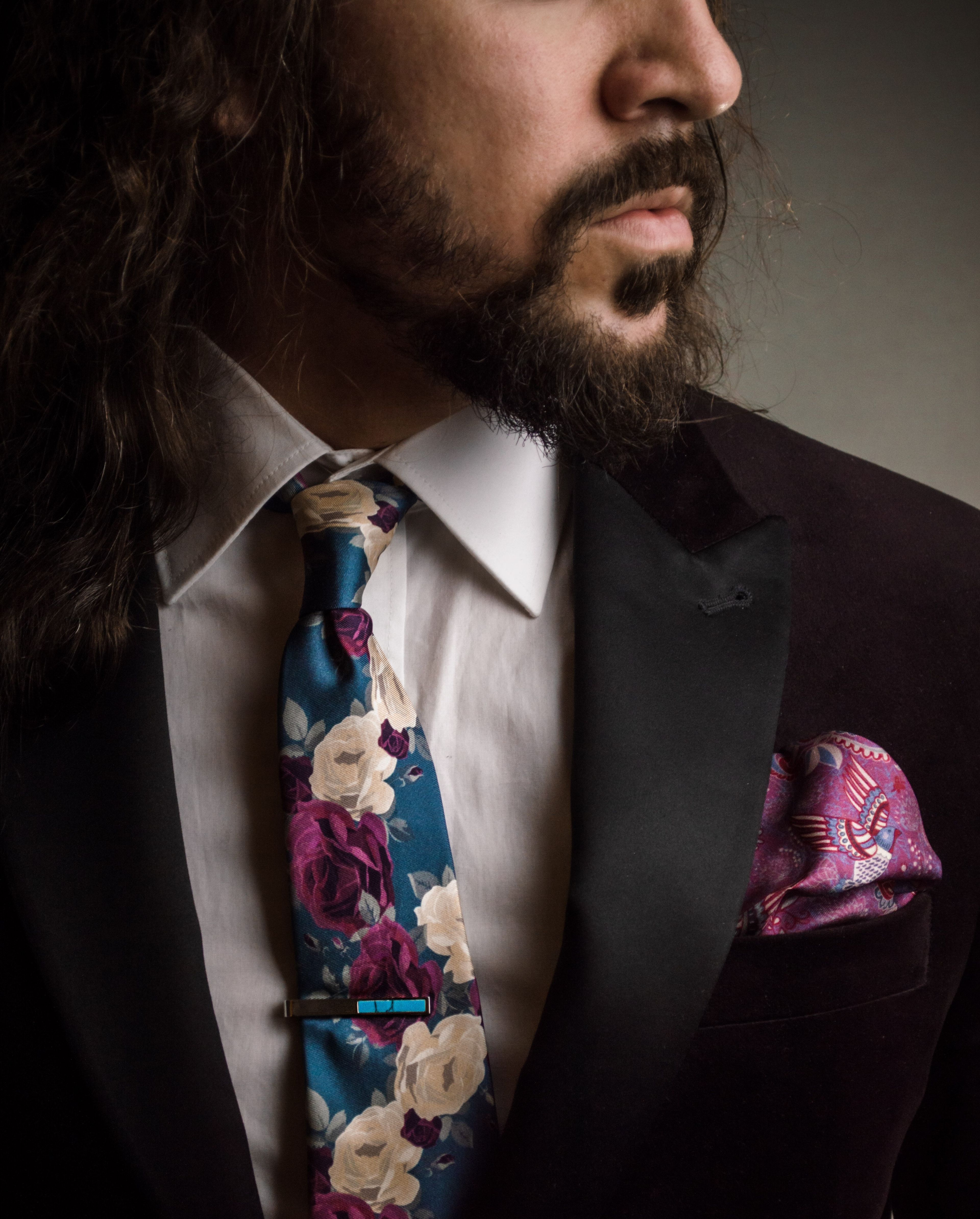
The boldest choice. Think orange pocket square with a navy jacket, or a green ascot with a deep red blazer to make a statement.
Get the look
Upgrade your arsenal of style with a complete look
-affiliate_-r-o_male_-q1--2024-01-29-09-23-13--instagram_(1).jpg?format=pjpg&auto=webp&quality=100&width=3840)


MATCHING YOUR METALS & LEATHERS
- Match your metals (e.g., silver watch with a silver belt buckle, silver cufflinks, silver lapel pin, etc.).
- Mix metals if your statement piece (most likely your watch) is two-toned by design.
- Mix your leathers.
Get the look
Upgrade your arsenal of style with a complete look


TAILOR TO YOUR STYLE
With these tips, you’ll master the art of coordinating your accessories, making every piece you wear a seamless part of your style.
To level up your style game even more, check out our ultimate guide to folding pocket squares and our step-by-step guide to tying next-level neckties knots.
And remember, accessories are for expression. You do you.

Fading Diamond Set
£33.99

Simple Silver-Tone Set
£33.99

Solid Modern Set
£29.99

Silver-Tone Tiger’s Eye Tie Bar and Cufflinks Set
£38.99

Gold-Tone Wave Set
£36.99

Solitary Stone Set
£33.99

Silver-Tone Cross Pattern Set
£33.99

Blackboard Set
£33.99

Fine Silver & Black Set
£33.99

Vanishing Point Set
£33.99

Anchor Tie Clip and Cufflinks Set
£33.99

Stiletto Classic Set
£29.99

Divided Black Modern Set
£29.99

Black Ambition Set
£31.99

Black Stone Set
£38.99

Gold-Tone Cufflinks and Tie Bar Set
£33.99

Short Grey Black Set
£59.99

Silver-Tone and Blue Geometric Tie Bar and Cufflinks Set
£49.99

Silver-Tone Geometric Tie Bar and Cufflinks Set
£45.99

Gold-Tone Geometric Tie Bar and Cufflinks Set
£45.99

RELATED ARTICLES
Your Guide to 7 Luxurious Suit Accessories | Look Like a Pro
Stand out from the crowd with luxurious suit accessories. Our guide takes you from cashmere ties to silk pocket squares, with a layover in 925s sterling silver tie clips and gold cufflinks. Enjoy the ride.
How to Wear a Bow Tie - And Wear It Well - Trendhim
How to tie a bow tie: a step-by-step guide for getting yours right every time.
The Lapel Pin - Your Ultimate Guide
Learn everything you need to know about the lapel pin in this ultimate guide.
